Avantis Pilates e Fisioterapia
[PT-BR]
Avantis nasceu do verbo latino avançar, mas seu verdadeiro significado está nas histórias que escolhem não parar. A história do fisioterapeuta Rafael é uma delas. Antes de abrir sua própria clínica, ele viveu o cuidado em sua forma mais genuína: foi missionário, dedicando parte da vida a projetos voluntários na África. Lá, entendeu que o toque mais transformador não é o das mãos, é o do propósito. Esse olhar humano e empático moldou o profissional que ele se tornou: alguém que enxerga cada paciente como um universo de possibilidades para recomeçar. A Avantis surge desse mesmo impulso: o de promover vida e movimento através de um cuidado que acolhe e encoraja. Mais do que tratar o corpo, a marca acredita em cuidar das pessoas para que avancem: física, emocional e simbolicamente. É um espaço para reequilibrar, fortalecer e seguir em frente com leveza.
[EN]
Avantis was born from the Latin verb “to advance,” but its true meaning lives in the stories that choose not to stop. The story of physiotherapist Rafael is one of them. Before opening his own clinic, he experienced care in its most genuine form: he was a missionary, dedicating part of his life to volunteer projects in Africa. There, he understood that the most transformative touch isn’t from the hands — it’s from purpose.
This human, empathetic perspective shaped the professional he became: someone who sees each patient as a universe of possibilities ready to begin again.
Avantis emerges from that same impulse: to bring life and movement through care that embraces and encourages. More than treating the body, the brand believes in caring for people so they can move forward — physically, emotionally, and symbolically.
It is a space to rebalance, strengthen, and continue ahead with lightness.
[PT-BR]
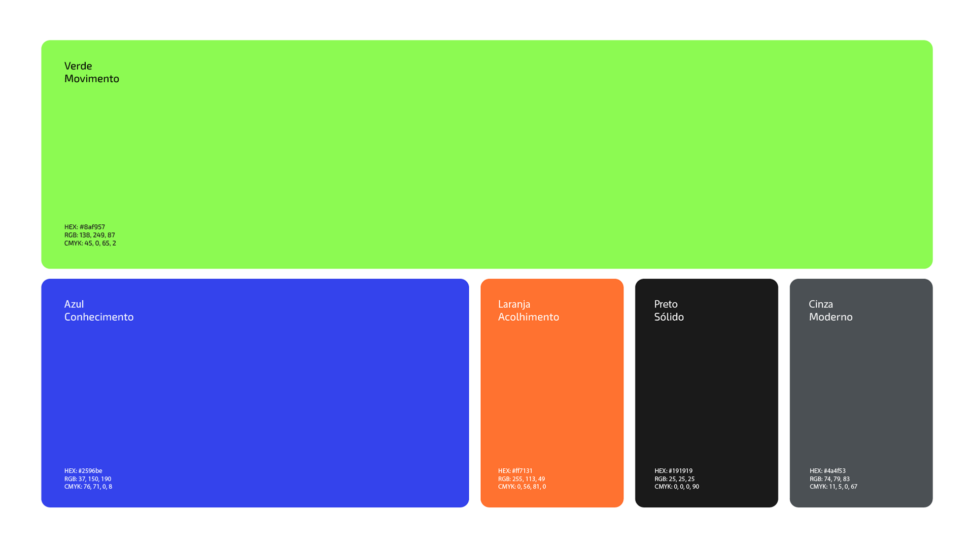
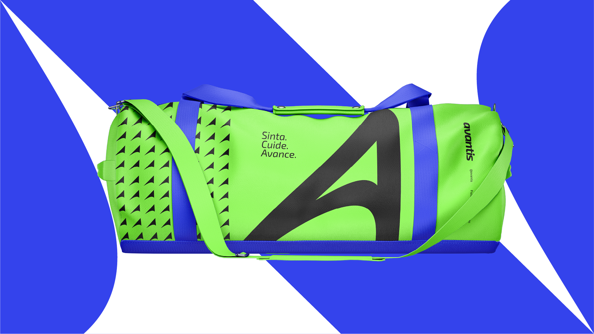
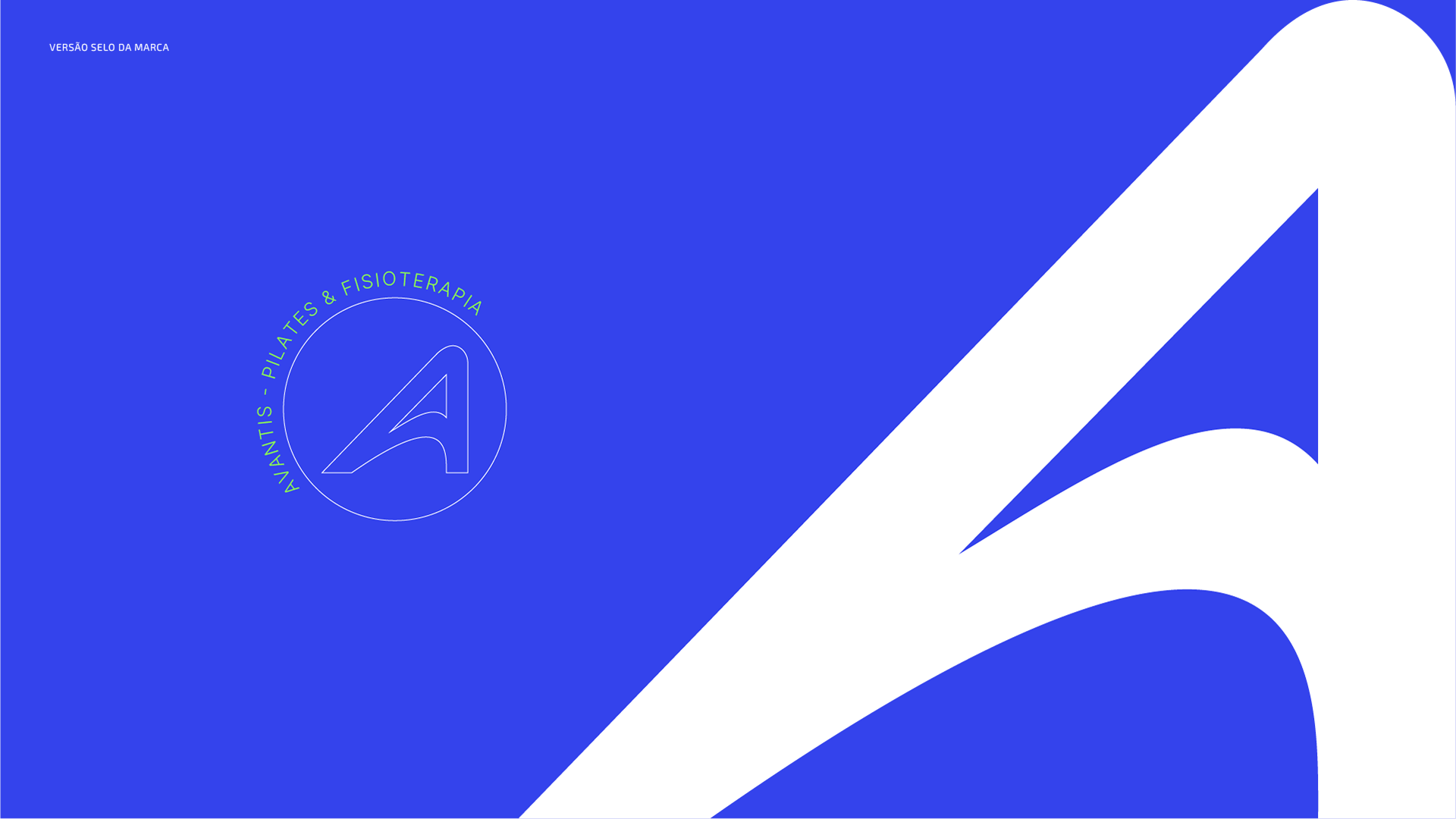
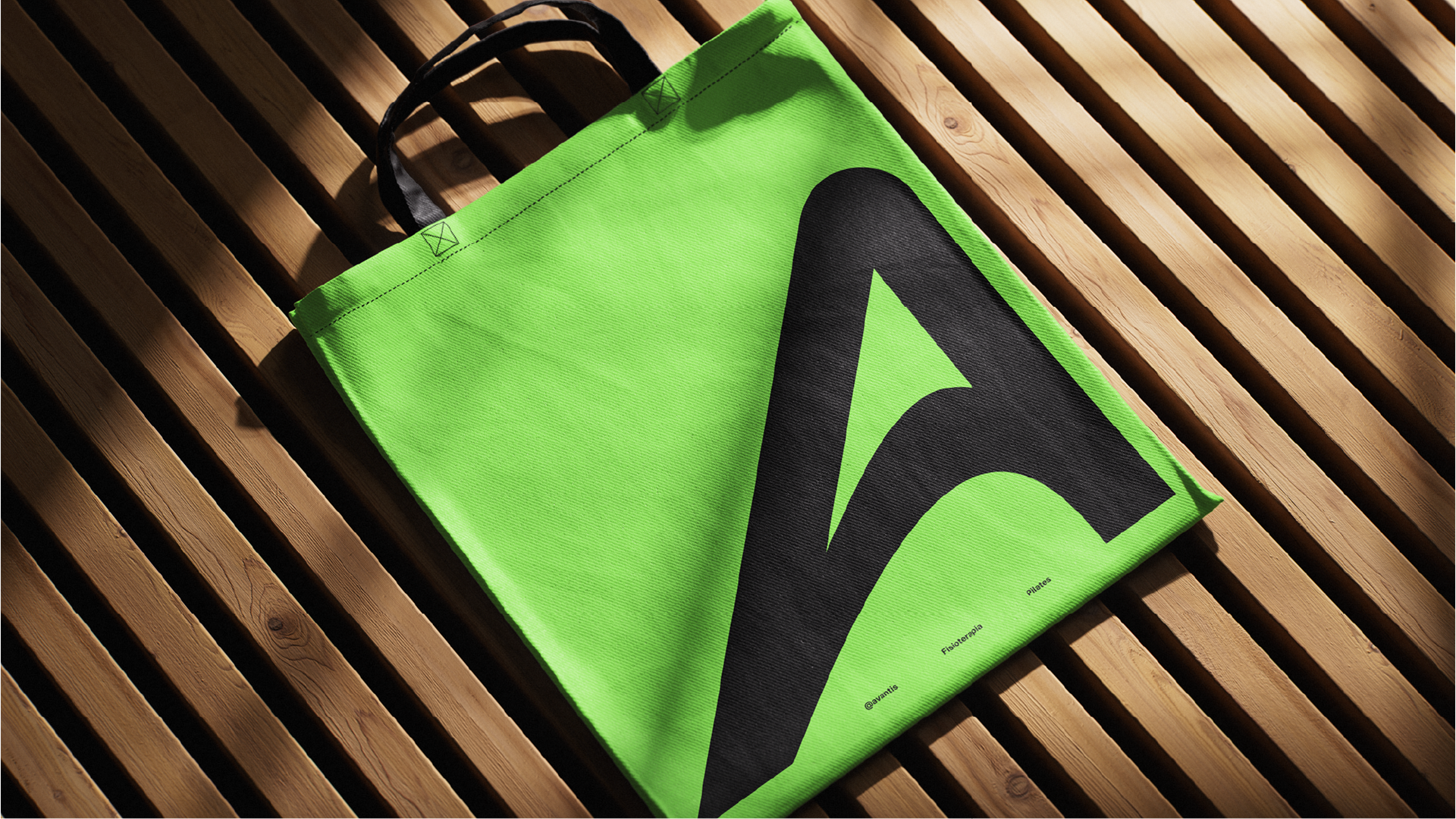
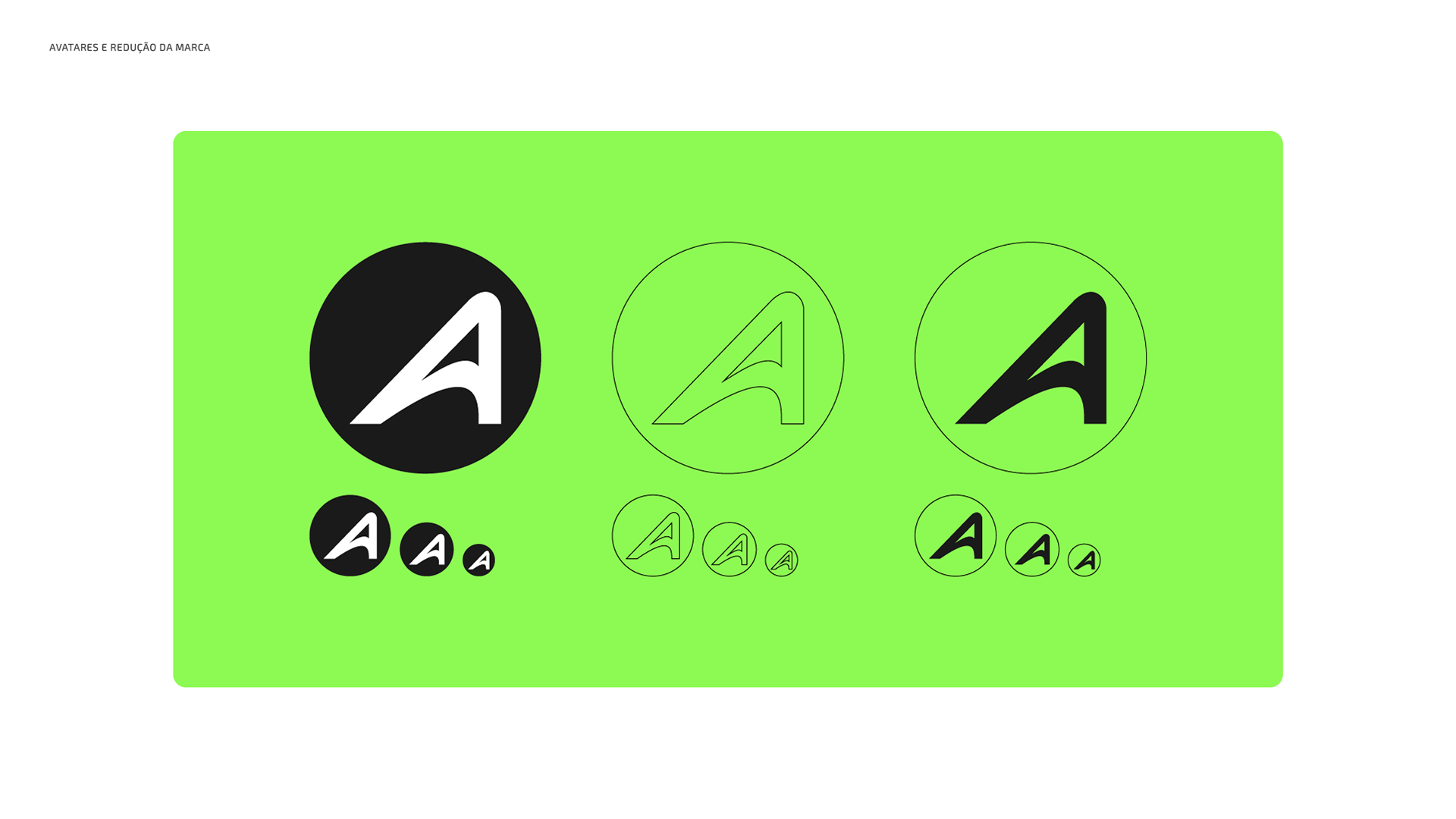
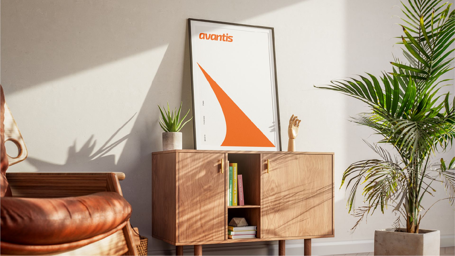
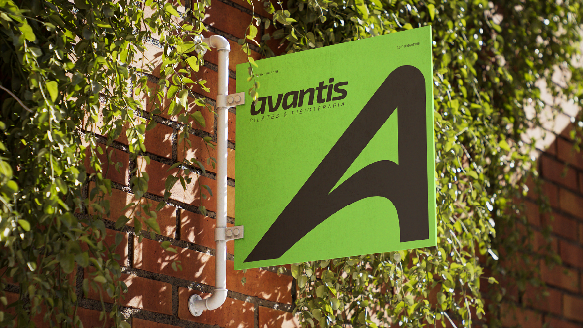
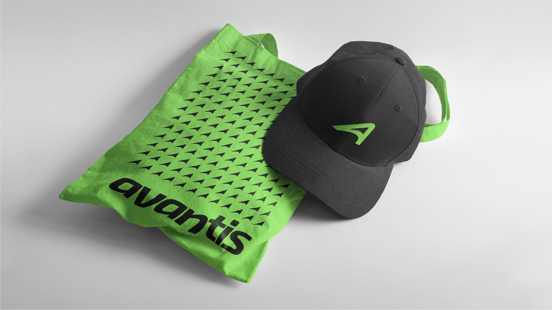
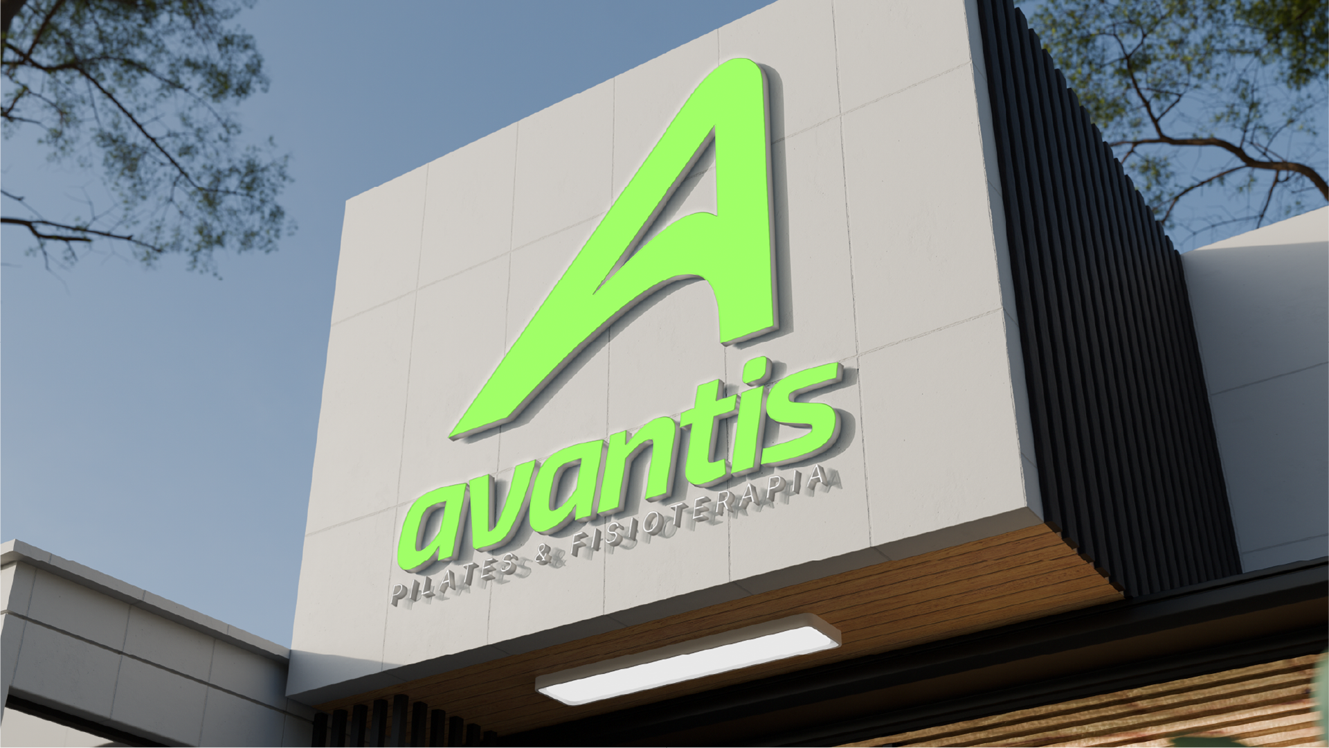
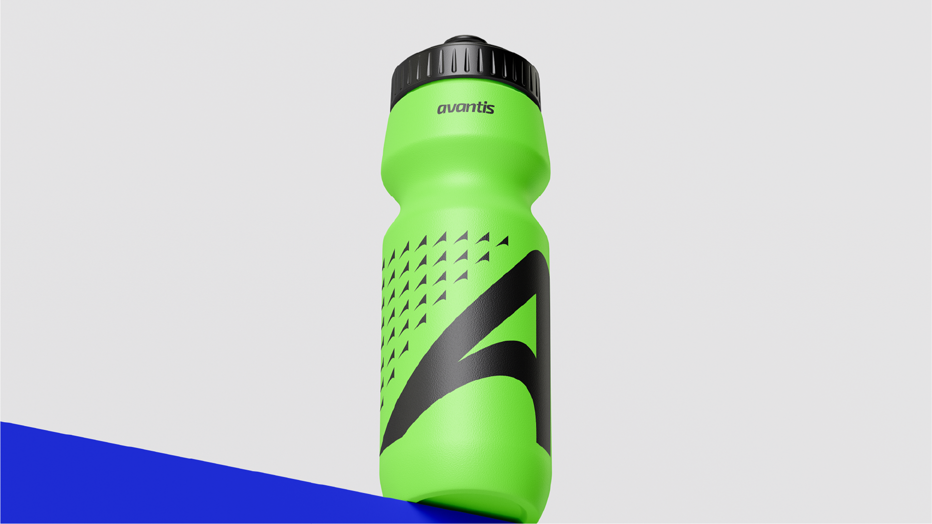
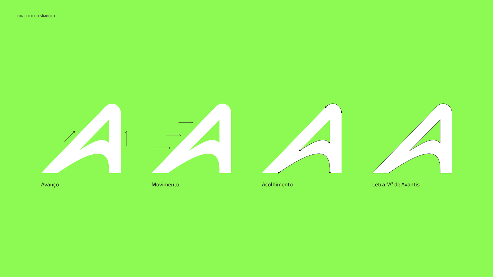
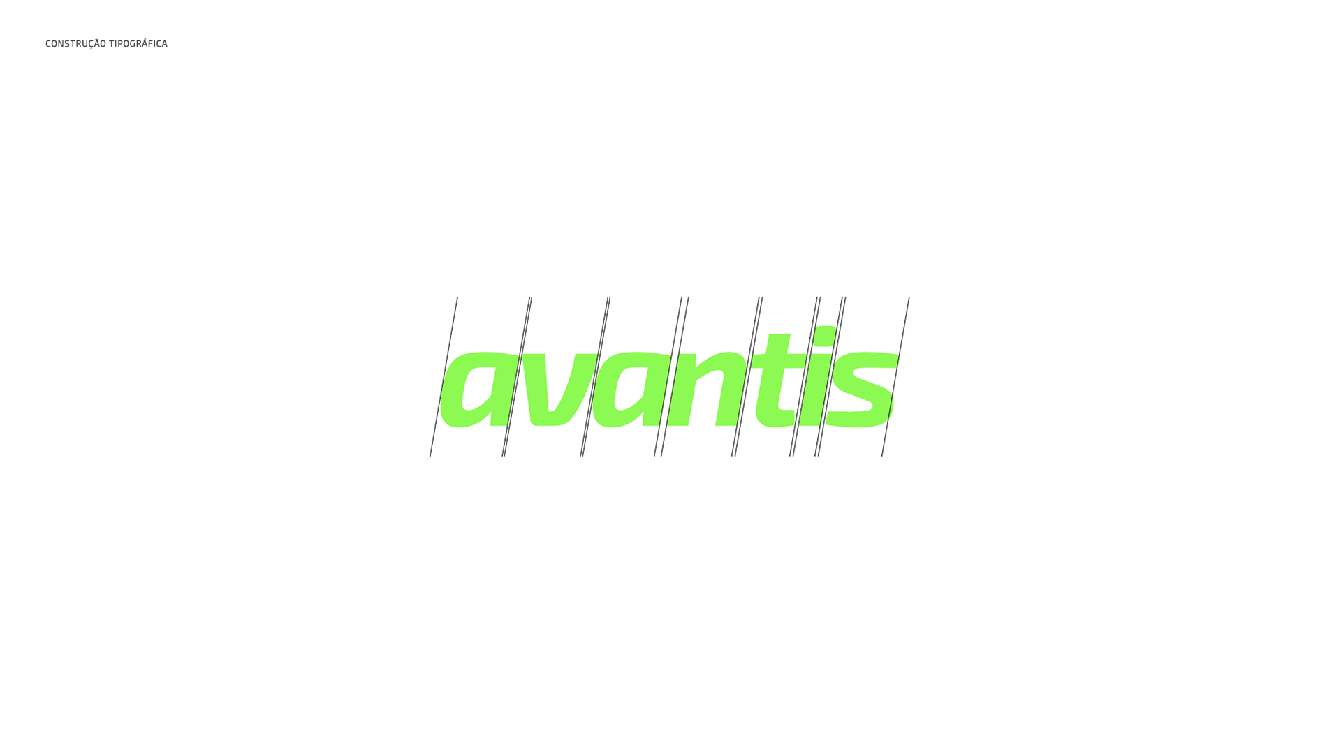
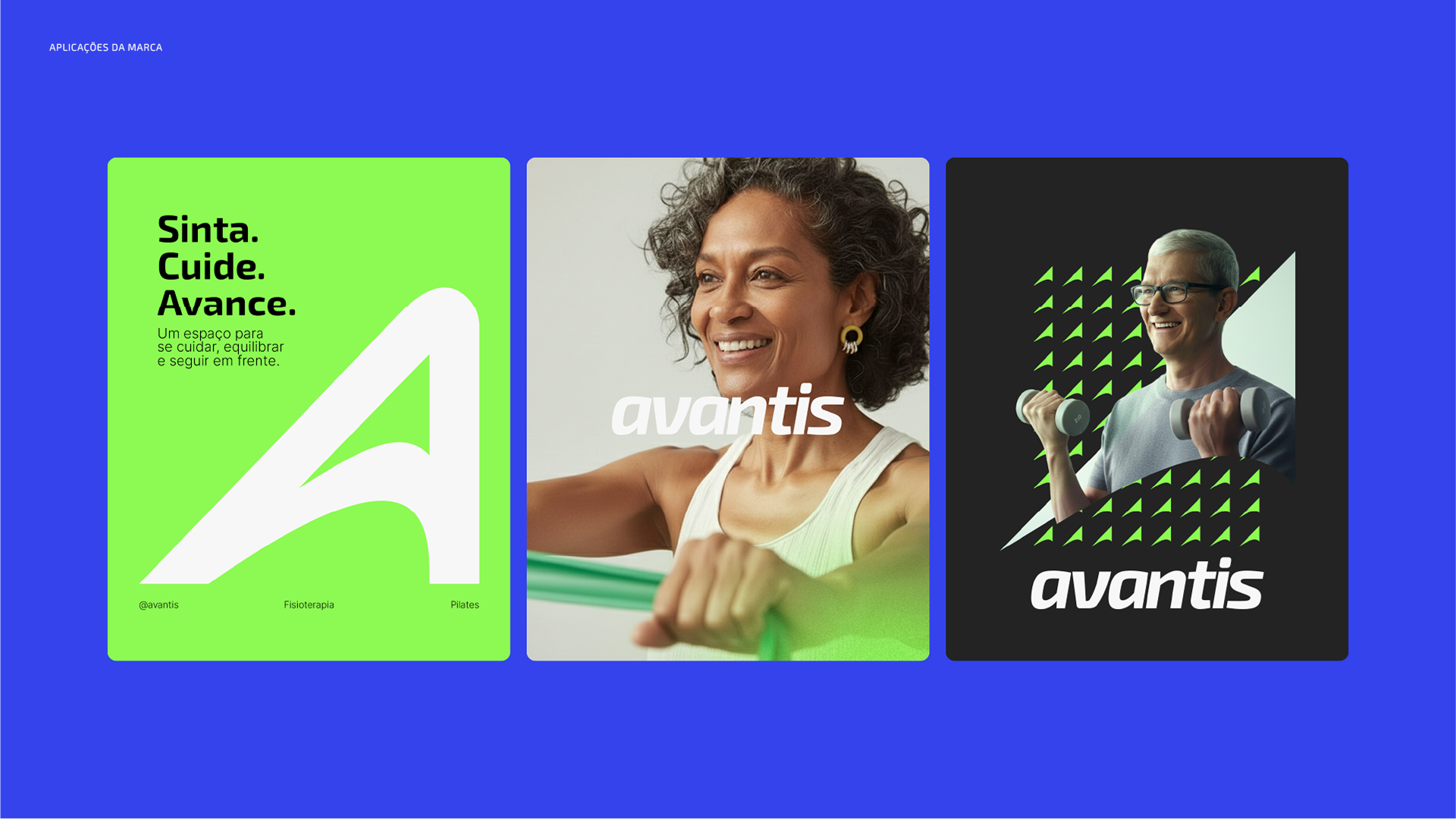
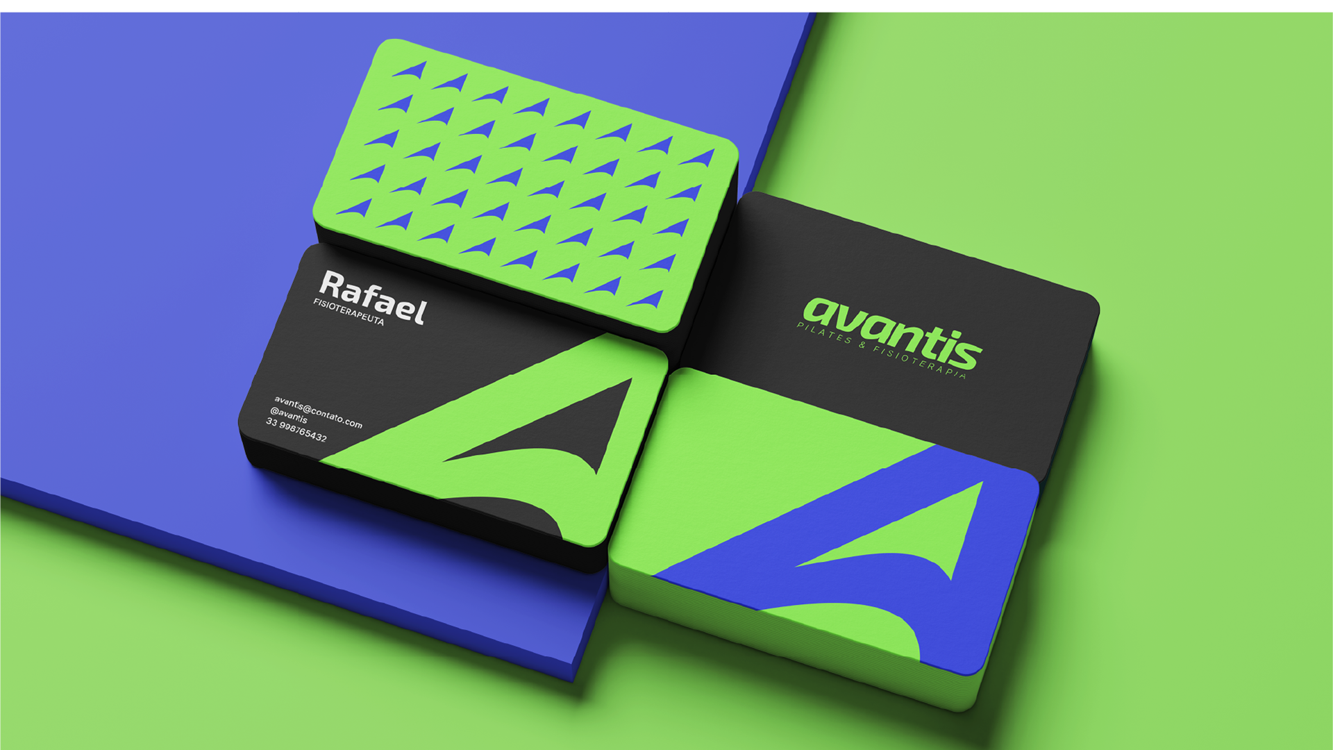
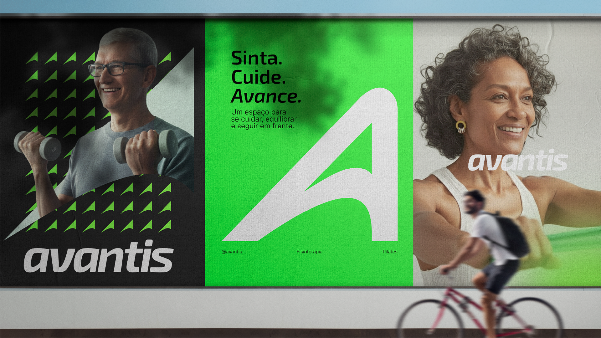
Visualmente, a marca traduz o que o nome anuncia: movimento, progresso e serenidade. O “A” ascendente simboliza avanço constante, enquanto o traço contínuo expressa fluidez e continuidade. A tipografia itálica reforça a ideia de impulso e o verde vibrante representa vitalidade, uma energia que inspira renovação. Tudo foi desenhado para comunicar o mesmo princípio que guia Rafael desde o início: O movimento é vida e cuidar é o que nos faz avançar.
[EN]
Visually, the brand reflects what its name conveys: movement, progress, and serenity.
The ascending “A” symbolizes constant advancement, while the continuous line expresses fluidity and continuity.
The italic typography reinforces the idea of momentum, and the vibrant green represents vitality — an energy that inspires renewal.
Everything was designed to communicate the same principle that has guided Rafael from the beginning: movement is life, and caring is what allows us to move forward.
Visually, the brand reflects what its name conveys: movement, progress, and serenity.
The ascending “A” symbolizes constant advancement, while the continuous line expresses fluidity and continuity.
The italic typography reinforces the idea of momentum, and the vibrant green represents vitality — an energy that inspires renewal.
Everything was designed to communicate the same principle that has guided Rafael from the beginning: movement is life, and caring is what allows us to move forward.